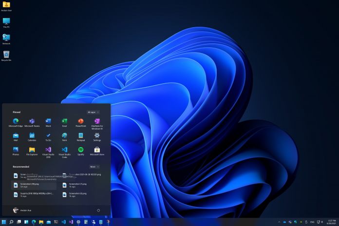
That is now changing thanks to some images sent out by a Microsoft employee. Microsoft watcher Tom Warren took to Twitter to highlight the images, which show the new File Explorer, Settings app, and Dark Mode. Microsoft is not reinventing the wheel with the File Explorer. You won’t see a new UI, but instead a design upgrade with smoother icons and cleaner aesthetics. It makes sense to leave the general functionality of the File Explorer the same considering it is essentially the hub of Windows that people are familiar with. As for the Settings app, it has undergone a slight UI shift and now looks more organized and professional. Microsoft is splitting options under each settings menu into easier to see boxes. These boxes are expandable to see added settings.
Dark Mode
The Settings app clearly shows the design choices of Windows 11 over Windows 10. However, it is worth noting that Microsoft’s seemingly never-ending transition from the Control Panel to the Settings app remains. This set of images also shows the Start menu in dark mode, a Windows 11 section we had only seen in the regular light mode. As for the overall dark mode look, it adds a nice layer of style to Windows 11 and if anything makes Microsoft’s new design and UI choices stand out even more. Tip of the day: Worried about your privacy in Windows 10 or want to keep different PCs linked to your Microsoft account strictly separate? We show you how to adjust your Windows 10 sync settings , including the clipboard, activity history/timeline, and themes.


